
Rui Rodrigues
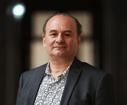
Rui Rodrigues, winner of the Best Poster Award at the 2024 ISN-JNC Flagship School in Greece, shares practical advice on creating clear, engaging, and memorable scientific posters.

About
Rui Rodrigues is a Marie Curie postdoctoral fellow at INSERM in Bordeaux, researching cannabinoids and brain function. He is also the founder of Fala-me Neuro.
How do you decide what information to include on your poster and what to leave out?
I try to prioritise the research question, briefly show how we addressed it, and explain key findings and their relevance to the topic. It's really difficult because, as a scientist, you are usually attached to your data and try to include everything. However, it's really important to leave out details about methods and ancillary data to maintain clarity and focus.
How do you make sure the most important points of your research stand out on your poster?
Dividing the poster into clear sections usually helps both the presenter and the reader to position themselves. I usually allocate two-thirds of the poster to the rationale, main findings, and conclusions, and I use bold headings for each results subsection. If the results are published, I typically include a QR code with a direct link to the online version of the paper.
What is the best way to effectively communicate your research when you only have limited time to present?
The best approach for me is to prepare an elevator pitch of about 5–10 minutes that tells a story. Then, of course, I focus on making key points, such as the main hypothesis and main findings, stand out. Using an informative and engaging title, arranging results in 'fast blocks of information, and supporting them with appealing visuals usually helps (people are often bored by excessive text). Highlighting the conclusion and significance of the findings with colorful diagrams or schemes also helps people retain the overall message.
How do you adapt your approach when presenting your poster to different audiences? For instance, how does your presentation style differ when engaging with participants at the Flagship School compared to experienced researchers?
Engaging and adapting to different audiences can be tricky, especially if it’s your first time presenting a poster. Try to gauge the audience beforehand by asking if they work in the field or not. My tip is to simplify concepts and use relatable analogies for non-experts while focusing on detailed data and technical nuances for experienced researchers. I aim to keep it engaging for both audiences by tailoring my language and leaving room for discussion during the presentation, so everyone can participate.
How would you (quickly) describe your research to those who are unfamiliar with neurochemistry?
Keeping it as simple as possible and, again, using analogies for complex concepts is key. There is a danger of oversimplification, but I usually focus on discussing the main findings without going into too many specifics. Non-experts often only remember the main message, so it’s important to ensure that it is clear and impactful. For example: 'I study how chemical imbalances in the brain contribute to mental illnesses, like depression, aiming to understand their causes and identify better treatments.
What approaches do you use to make your research relatable and engaging?
Being passionate about your research and using real-world examples to explain complex processes (for instance, how chronic stress may impact a specific process in the brain) can make your presentation more relatable. Emphasizing the impact of the findings through varied voice intonation also helps to capture attention. One technique that often works is inviting questions from the audience to create an interactive experience.
What design or text choices do you think are the most important for grabbing someone’s attention in busy poster sessions?
I usually use a clean, organised layout with bold headings, subheadings, contrasting colors, and minimal text. High-quality visuals are essential for immediately capturing attention.
Are there any specific methods you used during the Flagship School that made your poster interesting?
Not particularly. I just tried to keep it simple and relaxed, knowing I was addressing people from different backgrounds and working on diverse research topics.
What is the one thing that people need to remember when presenting a scientific poster?
I think a key takeaway would be to engage the audience both visually and verbally while presenting a clear, compelling story that highlights the significance of your research.
Heading

Become a part of ISN
Join ISN now to become part of the ISN community, connecting people around the globe and across neurochemical specialities.
